
A video landing page isn’t automatically stronger than a traditional one. Knowing how to use video on landing pages starts with the conversion goal: choose video when a demonstration, explanation, or customer story can help visitors act. If a headline and a few lines of copy already make the offer clear, a traditional page may be the sharper choice.
Video can grab attention, but attention alone isn’t the result that matters. The page still needs focused copy, supporting visuals, a clear call to action, and a video that reinforces the offer rather than competing with it. This guide explains what video landing pages are, when to use one, and how to choose a format, length, and placement that help visitors take the next step.
Key Takeaways
- Choose video when a demonstration, explanation, or customer story makes your offer easier to understand; keep a traditional page when concise copy can do the job.
- Match the video, supporting visuals, and page copy to one clear conversion goal, then guide visitors toward a focused call to action.
- Use captions and concise supporting text so visitors can understand the message even when they can’t or don’t watch with sound.
- Set video length and placement according to its role on the page, then test variations to see which combination supports stronger engagement and conversions.
- For a landing page that needs coordinated design and video, SEO Guru Houston offers Websites Dev & Landing Pages and Website Video Marketing.
1. What Are Video Landing Pages?
A video landing page pairs a focused offer with video that helps visitors understand or trust it. The video might demonstrate a product, explain a service, promote an event, or feature a customer testimonial. Unlike a general social video, it supports one page goal, such as a registration, purchase, or inquiry. The surrounding copy and call to action should reinforce that same goal.
Choose a hosting platform that supports responsive playback, captions, player controls, and useful engagement analytics. These features help visitors watch on different screen sizes and let you assess performance. Use an embed that fits the page layout instead of a separate player that distracts from the offer. The right choice supports both the page experience and your measurement needs.
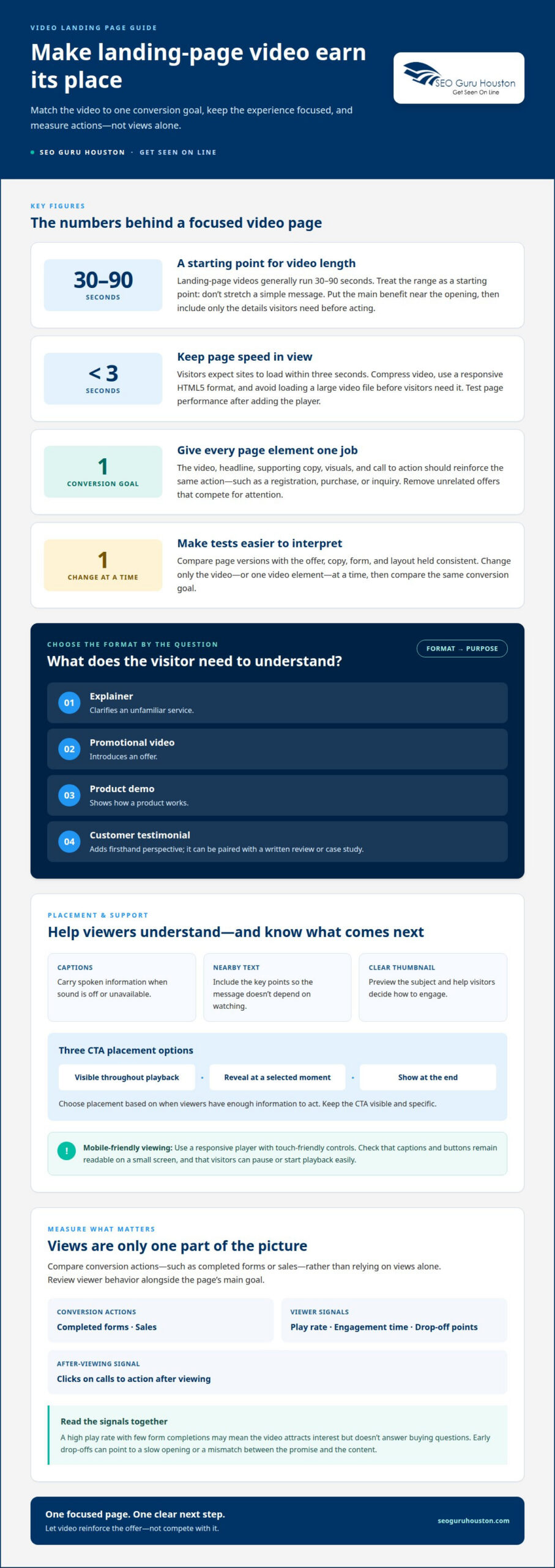
To optimize speed, compress the video file and use a responsive HTML5 video format. Make the player fit mobile and desktop layouts, with touch-friendly controls for phone viewers. Avoid loading a large video file before visitors need it, and test page performance after adding the player. Visitors expect sites to load within three seconds, so video should not overwhelm the rest of the page.
Test whether video helps by comparing a page version with video against one without it. Keep the offer, copy, form, and layout consistent, changing only the video. Compare conversion actions, such as completed forms or sales, rather than relying on views alone. Also track play rate, engagement time, drop-off points, and clicks on calls to action after viewing. For businesses seeking an evidence-led approach to campaign performance, agencies like freshfacedmarketing.co.uk similarly emphasize tracking tangible business outcomes over vanity metrics. This controlled comparison is a practical way to decide how to use video on landing pages.
After establishing that comparison, test video versions by changing one element at a time. For example, compare an explainer with a customer testimonial, or test different lengths and placements. You can also compare autoplay with autoplay off, and muted playback with sound available. Measure whether each change affects conversions, viewer behavior, or brand impressions.
Match the format to the question visitors need answered. An explainer clarifies an unfamiliar service; a promotional video introduces an offer; a demo shows how a product works. A customer testimonial adds firsthand perspective, especially when paired with a written review or case study. Each format should capture attention without drawing viewers away from the page’s next step.
Run split tests long enough to compare the same conversion goal across versions, then review the results together. A high play rate with few form completions may mean the video attracts interest but doesn’t answer buying questions. Early drop-offs can point to a slow opening or a mismatch between the promise and the content. Use these signals to refine the script, layout, length, or playback approach. This gives you a stronger basis for deciding how to use video on landing pages.
2. Supporting copy, visuals, and calls to action
Make every page element support the same conversion action. If a video invites visitors to register for a webinar, the headline, supporting copy, visuals, and button should all reinforce registration. State the intended audience, the benefit, and what happens next. Remove unrelated offers from the section so visitors don’t have to choose between competing actions.
Captions and a clear thumbnail help visitors decide how to engage with a video. Captions communicate spoken information without sound, while a thumbnail previews the subject before playback. The U.S. Department of Justice identifies open, closed, and real-time captioning among accessibility aids and services. Include the video’s key points in nearby text, too, so the core message doesn’t depend on watching.
Keep the call to action visible and specific. A button labeled “Register for the webinar” sets a clearer expectation than a vague “Learn more.” A landing-page video can keep its CTA visible throughout playback, reveal it at a selected moment, or show it at the end. Choose the placement based on when viewers have enough information to act.
For an event page, a 30-second clip from a previous year’s keynote can preview the experience. Pair it with concise copy that explains the event and a registration button. If visitors are being asked to set aside an hour, the teaser should make the reason to attend clear. The video earns attention; the CTA turns that attention into action.
Use visuals to clarify, not decorate. A product close-up, a software demo screenshot, or a customer testimonial can make the video’s point easier to follow. Match each visual to the message at that moment. If a testimonial describes a specific benefit, place a supporting quote nearby rather than adding unrelated images that compete for attention.
Directional cues can guide viewers toward the conversion goal without introducing another offer. A speaker can point toward the registration button, an animation can highlight the form, or narration can explain the next step. Keep every cue aligned with one main action. Multiple prompts can divide attention instead of guiding it.
To make landing-page video accessible and mobile-friendly, add captions, provide the key message in text, and use a responsive player with touch-friendly controls. Check that captions and buttons remain readable on a small screen, and that visitors can pause or start playback easily.
Strong copy, purposeful visuals, and a well-placed CTA turn video engagement into a defined next step. If the page needs a more cohesive structure, landing page design can align its message, video, and conversion action.
3. Video length, format, and placement
Choose length and placement by matching the video’s job to the audience’s decision. Landing-page videos generally run 30–90 seconds, but that range is a starting point, not a reason to stretch a simple message. Put the main benefit near the opening, then use only the details visitors need before acting. A concise, well-paced video gives the offer room to stand out without making playback a distraction.
Placement changes how much explanation viewers expect. An above-the-fold video should usually run 30–60 seconds, since it shares the first screen with the headline and offer. A mid-page demo can run 2–3 minutes when visitors need to see several steps. A background loop should stay around 10–15 seconds and support the page visually, without carrying essential information.
Let the format follow the message. A testimonial video can run 45–90 seconds, giving a customer room to describe a problem, experience, and outcome. A product that needs a quick introduction may suit a 30-second commercial-style video. An advanced idea may need an explainer of 90 seconds, provided each scene adds clarity. Keep long-form detail off the main conversion path unless the offer genuinely requires it.
Pacing matters as much as runtime. Viewer attention drops significantly after 2 minutes, so introduce the core point early and remove pauses, repeated claims, and unrelated scenes. Vidyard reports that 62% of visitors watch a video to completion when it’s under 60 seconds long. That figure supports concise editing, but the best duration still depends on what visitors need to understand.
To add video to a landing page, upload or host the finished file, then place its player in the page editor or add the platform’s embed code. Position it beside the relevant headline or offer, and confirm that the player fits the page layout. Keep controls available and make sure the video doesn’t obscure the form or primary action.
Use split testing to find the right length and placement for your offer. For example, compare a 30-second version with a 60-second version while keeping the headline, form, and CTA consistent. Measure completed forms or sales alongside play rate and drop-off points. If visitors start but leave before the main benefit appears, tighten the opening. If a demo attracts views but few conversions, test a clearer next step.
Autoplay can change how visitors experience the first screen. Test playback with autoplay on and off, including muted playback, then compare conversion actions and engagement. A webinar page, for example, might benefit from a short preview near its registration message, while a detailed demo may work better farther down the page. Let measured audience behavior guide the format and placement.
4. Explainer videos
An explainer video turns a difficult product message into a visual sequence. For software, show the problem, the relevant screen, and the result a user wants. Product website videos intended for initial engagement work best at 30–45 seconds. Use that time to clarify one benefit, not to tour every feature or menu.
Start with a script before recording. Describe the visitor’s problem in plain language, then connect it to one product capability and one next step. For example, a scheduling platform might show a missed handoff, a shared calendar, and a completed booking. Tie the narration to what appears onscreen so viewers can follow the message without guessing.
Product interface footage makes software easier to understand because visitors see the actual screen. Record a clean screencast focused on the relevant workflow, then add narration afterward. This gives you more control over audio quality and lets the voice track explain each action precisely. Zoom in or crop around important controls, but preserve enough screen context to make each step clear.
Motion graphics can clarify concepts that a software screen cannot show by itself. A simple animation might trace how information moves from a form into a dashboard, with labels identifying each stage. Creative visual teams like TM Studio emphasize making transitions purposeful: use movement to show cause and effect, not as decoration. Pair graphics with genuine interface footage when the promise concerns a real product workflow.
An advanced idea may need an explainer video of 90 seconds to make the process clear. Use that time deliberately: introduce the challenge, demonstrate the solution, and state the practical benefit. Remove repeated claims and long openings. If the core message still feels crowded, split the explanation between the video and concise page copy rather than adding every detail to the edit.
Templates can speed production, but adapt every scene to the offer. A generic opener that delays the product wastes attention; replace it with the audience’s specific problem. For a project-management tool, show a task moving from assignment to completion. For a complex dashboard, highlight only the controls that support the landing page’s promise.
After adding an explainer to the page, check that its opening matches the headline and the CTA remains clear. Compare a focused interface demonstration with a version that uses more motion graphics. Track viewer drop-off and CTA clicks alongside form completions. If viewers leave before the key feature appears, move the demonstration earlier. Test the edit against the page goal, not production polish alone.
5. Video versus traditional landing pages
Video can make a product, service, or customer experience easier to understand. A traditional landing page can communicate the offer faster through a headline, concise copy, and a form. Choose based on what visitors need before acting: a complex software workflow may benefit from a demonstration, while a straightforward consultation offer may need only clear text.
Landing-page video can slow loading, make autoplay distracting, or hide essential information inside the player. If a mobile visitor can’t quickly understand the offer, video may add friction instead of supporting conversion. Captions, visible controls, and concise text help keep the message accessible and useful across devices.
Don’t treat video as a substitute for the page’s core content. Visitors who can’t play sound, have limited time, or prefer scanning still need the offer, its main benefit, and the next action in text. For example, a product demo can show how a feature works, while nearby copy explains who benefits and what the visitor can do next.
Traditional pages work well when visitors need to scan details to make a decision. A service page with clear headings, a short list of deliverables, and a direct inquiry form lets readers find specific information quickly. Video can complement that layout, but a long narrative may bury the answer visitors came to find.
Video also requires production and maintenance. A product interface can change, making an old software walkthrough inaccurate. A testimonial may refer to an offer that has since changed. Assign someone to review each video when the product, pricing, process, or campaign message changes, and update the script or replace the video as needed.
Compare video and text with a controlled A/B test. Keep the headline, offer, form, and audience consistent, then change whether the page includes video. Track the conversion action, such as completed registrations or inquiries, alongside page load and video engagement. A higher play count alone doesn’t show that the video helped achieve the business goal.
Include mobile behavior in the comparison. Check that the player fits the screen, controls work by touch, and the CTA is easy to find on common devices. Test autoplay on and off, since unexpected sound or motion can distract visitors. Review bounce and conversion behavior together; a change in one metric alone may not explain overall page performance.
The practical choice is not video versus text in every case. Use a traditional page when concise copy answers the visitor’s question; add video when seeing or hearing an explanation resolves a real barrier. To shape a page around that decision, build a conversion-focused landing page with video and supporting copy aligned to one action.
SEO Guru Houston: Websites Dev & Landing Pages
SEO Guru Houston brings landing page design and video strategy together when your page needs a clearer path from first view to conversion. Its Websites Dev & Landing Pages offering can shape the page structure, message, and call to action around your goal, while Website Video Marketing supports the video’s role in that experience.
Turn to this support when deciding whether a page needs video, refining an existing landing page, or aligning video content with a campaign. The work connects page layout, video placement, and conversion-focused copy, giving visitors a consistent message throughout the experience.
Ready to plan a landing page that uses video with purpose? Contact SEO Guru Houston to discuss your goals.
Make your next landing page decision with purpose
Treat video as a strategic choice, not a default feature. Decide what visitors need to understand before acting, then choose the page experience that answers that need with the least friction. To use video on landing pages effectively, connect each creative decision to a campaign goal and measure the action that matters.
SEO Guru Houston can help align landing page strategy with broader digital marketing through Houston SEO Services, Houston PPC Services, and Houston B2B Marketing. That connection matters when a page must support both campaign traffic and a clear conversion path, rather than operate as an isolated asset.
Ready to shape your next page around a stronger digital strategy? Contact SEO Guru Houston to discuss your goals. Take the next step with a focused plan, and build momentum from there.
Frequently Asked Questions
What Are Video Landing Pages?
A video landing page is a focused campaign page where video helps visitors understand an offer or decide what to do next. For example, a product-trial page could pair a short walkthrough with eligibility details and a sign-up form. The video supports the page’s goal; it doesn’t replace essential information visitors may need before submitting their details.
What types of video work best on landing pages?
The strongest format depends on what visitors need to understand. Use a product demo to show a workflow, an explainer to clarify a complex idea, or a customer testimonial to offer a firsthand perspective. A promotional video can spotlight a time-sensitive event or offer. For a webinar page, choose a preview that communicates the event’s subject and value, not an unrelated product feature.
Should landing page videos autoplay, loop, or use sound?
Choose playback behavior that supports the page rather than interrupting it. Muted autoplay can introduce a visual message, while a loop suits a brief background that carries no essential information. Keep controls available so visitors can pause or replay. Test autoplay both on and off, since unexpected motion or sound may distract visitors from reading or completing a form.
How long should a landing page video be?
Set the runtime according to the video’s purpose and placement. A concise hero video can introduce an offer quickly, while a detailed demonstration may need more time to show its steps. Keep a short loop brief enough to feel atmospheric rather than repetitive. Cut any scene that doesn’t clarify the offer, answer a visitor’s concern, or support the intended action.
Where should you place a video on a landing page?
Place the video near the page content it explains. A short introduction can sit beside the headline, while a detailed product walkthrough may fit after visitors read the main benefits. On a registration page, position an event preview near the agenda or sign-up form. Check the mobile layout separately: a player that pushes the form far down can make the next step harder to find.
How do landing page videos affect conversion rates?
Video can support conversions when it answers a question that might otherwise stop a visitor from acting. A software demo can clarify how a feature works; a customer story can address concerns about using a service. Video can also slow a page or distract from its offer. Compare results with and without video, using the same conversion goal and page content wherever possible.
How do you measure the performance of a landing page video?
Measure video behavior alongside the page’s business outcome. Track how often visitors start playback, how long they watch, where they stop, and whether they click the CTA or complete the form afterward. For an event page, compare registrations among visitors who engage with the preview with overall registration activity. Use these combined signals to decide what content or placement to test next.
What video hosting platforms are best for landing pages?
Choose a platform that supports responsive playback, captions, player controls, and useful engagement analytics. The right fit supports your page experience and measurement needs.

